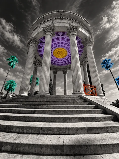
A Home in Altered Color: The Closing Images in a Phone Photography Series
Story by Feldenstein Calypso · 323 readers
A photographer’s color experiments turn familiar home scenes into a final, affectionate look at the place they may soon leave.

The last images in this color experiment bring its subject close to home. After applying carefully limited palettes to black-and-white photographs from several places, the photographer turns to the surroundings they live in now. The pictures offer a fresh look at a familiar place, while the accompanying note admits that a move may be ahead and lands on a small, affectionate judgment: home “isn’t so bad here.”
That feeling gives the series its quiet pull. These photographs aren’t presented as a grand farewell or a claim that every corner is beloved. The writer says they’re still trying to move away. Yet the altered pictures leave room for a second thought: even a place you expect to leave can hold scenes worth noticing. The images make that reconsideration visible by changing how ordinary surroundings register.
A repeated method, with a personal subject
The approach has stayed consistent across the series. The photographer takes pictures with a phone camera, alters them into black and white, then applies randomized short lists of carefully defined colors. The combination of a deliberate limit and a randomized selection gives the images a shared premise without making each one identical. Reality supplies the underlying photograph; the palette shifts its mood and emphasis.
That balance matters. These aren’t described as wholly invented scenes: the writer says the alterations remain “hard rooted in reality.” The original photographs continue to anchor the work, even as their color treatment changes what stands out. A familiar view can feel newly composed when its colors are reduced, rearranged or concentrated. The process asks the eye to revisit a place rather than simply recognize it and move on.
The earlier subjects ranged across flowers, “Saint Minneapolis,” the French city where the project began, and Japan. Now the photographer’s own home becomes the focus. That progression gives the closing group a different kind of intimacy. Earlier pictures looked outward to subjects and places; these return attention to the setting of everyday life. The shift isn’t explained as a planned narrative, but it gives the sequence a natural sense of arrival.
Looking again at a place you may leave
There’s a useful tension in the writer’s brief introduction. They say they won’t over-explain the images, and they don’t supply a detailed account of what each one depicts. Instead, they give enough context to make the experiment legible, then let the pictures carry the rest. That restraint suits a project built around looking: the explanation establishes the rules, while the altered photographs invite viewers to notice for themselves.
The admission about moving also keeps the note grounded. The writer doesn’t pretend that a visual exercise resolves their reasons for wanting to go. Nor does the closing observation erase that desire. “It’s not so bad here” is a modest conclusion, and its modesty is precisely what makes it feel personal. The pictures seem to have prompted a moment of recognition, rather than a sudden change of heart.
For anyone who has lived in a place long enough to stop seeing it clearly, that shift may feel familiar. Reworking a photograph can interrupt the quick recognition that makes streets, buildings and other surroundings fade into routine. A changed palette won’t tell us what the place means to its photographer, but it can make the act of looking feel active again. Here, the method offers a way to pay attention without requiring the writer to make a sweeping statement about home.
The images complete the thought
The accompanying sequence includes several linked photographs, among them files labeled “Golden Seagull Beneath a Pink Cloudscape,” “Selective Color Plaza Stroll,” “Selective-Color Cathedral Facade” and “Selective-Color Parisian Facade.” Those labels identify some of the images, while the post’s text leaves their individual stories open. The collection is best approached as a visual series rather than as a set of scenes that need a full written explanation.
The post also marks a pause. The photographer thinks this may be the end of the color reduction and mix-up pictures, at least for a while. There’s no promise of a next installment or a firm account of what comes after. That open-endedness feels right for a project whose method depends on returning to photographs with a different palette: the work can stop here, and the way of seeing can remain.
What stays with me is the scale of the conclusion. A series that has moved through flowers, Minneapolis, France and Japan ends not with a grand destination, but with the photographer’s own surroundings and a qualified note of appreciation. The altered colors don’t make home perfect or settle the question of leaving. They give the writer—and anyone looking along—a reason to pause before deciding what a familiar place is worth.